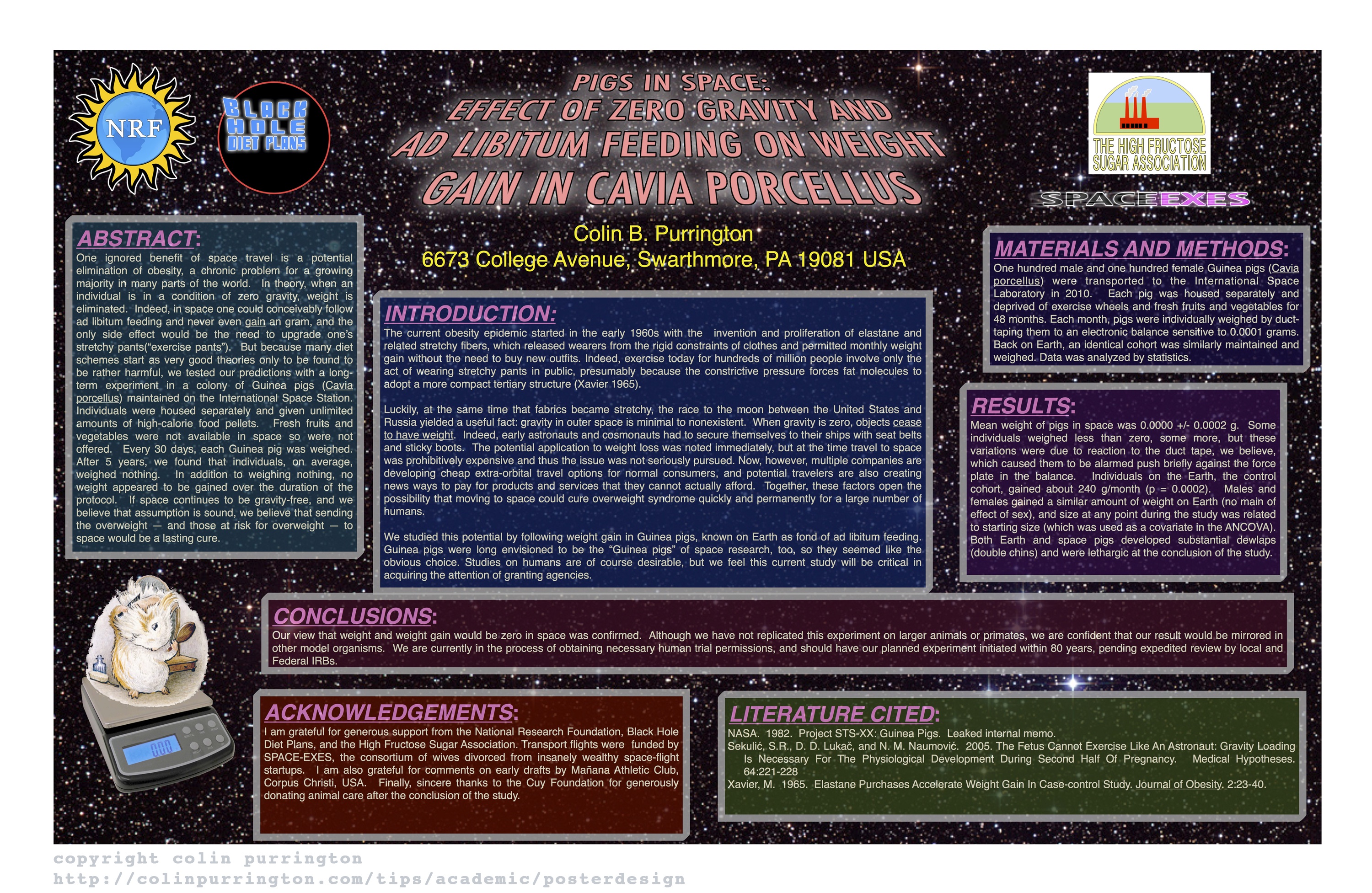
Bad Poster Design Example

Click image to see larger version
Overall Design
- Way too much text!
- Background too dark and very busy (distracting)
Title
- Star Wars themed word art is distracting and hard to read
- Title is in all caps obscures Latin name and hard to read
- Title is italicized, which also obscures Latin name style convention
- Author font and color is too bold compared to other font colors
Text Boxes
- Backgrounds are dark (hard to read) and are different colors (distracting/confusing)
- Different widths (aim for 45-65 characters per line)
- Edges not aligned (distracting)
- Text justified, which causes bad spacing.(use left-align)
Additional Issues
- Results are presented in sentences instead of visually with charts.
- Section headers have too much formatting
- Not an ideal graphic of the Guinea pig on scale. Use one that depicts the experimental actual set up
Good Poster Design Example


 Image from American Nurse today